House Price Prediction - Ames Housing Dataset


Predicting a value from data is a very common data science problem for example, predicting house prices based on neighbourhood or number of acres. A popular dataset of this sort is the Ames Housing dataset which can be found on Kaggle. In this article, I will walkthrough, step by step, the code I built for predicting house prices.
As usual in any data science project, import the required libraries.
# Importing the libraries

import numpy as np
import matplotlib.pyplot as plt
import pandas as pd
import seaborn as sns
Import the training and testing datasets as a dataframe. The datasets can be found on Kaggle.
# Importing the datasets and joining them together

train = pd.read_csv('train.csv')
test = pd.read_csv('test.csv')
Lets summarise the training dataset, so that we can get an overview of the data.
train.info()The result is shown below:
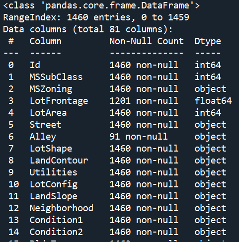
This shows that there are 80 columns in the dataset if you don't include the index. Now the goal here is to predict the 'SalePrice' for houses in the test dataset based on the other 79 features. That's a lot of variables to consider!
So where do we even begin?
The answer here is Exploratory Data Analysis (EDA). Before modelling the data it is always best practice to explore the dataset in order to get understanding of the how the different features may correlate with the y-variable, which in this case is the SalePrice. This also allows one to build a working hypothesis as it helps guide the project in terms of what variables you need to assess and potentially model.
A very powerful visualisation for this and one which I would use in any data science project is a correlation heatmap between all numerical columns in the training dataset and the SalePrice.
# Subset of training dataset with only numerical columns

train_num = train.select_dtypes(exclude='object').reset_index()

# Correlation Heatmap for Sale Price

train_num.corr()[['SalePrice']].sort_values(by='SalePrice', ascending=False)
plt.figure(figsize=(16,14), dpi=500)
chart4 = sns.heatmap(train_num.corr()[['SalePrice']].sort_values(by='SalePrice', ascending=False),
                     vmin=-1, vmax=1, cmap='BrBG',
                     )
chart4.set_title('Sale Price Correlation Heatmap', fontdict={'fontsize': 12},
                 pad=12)
plt.show()
The result is as shown below:
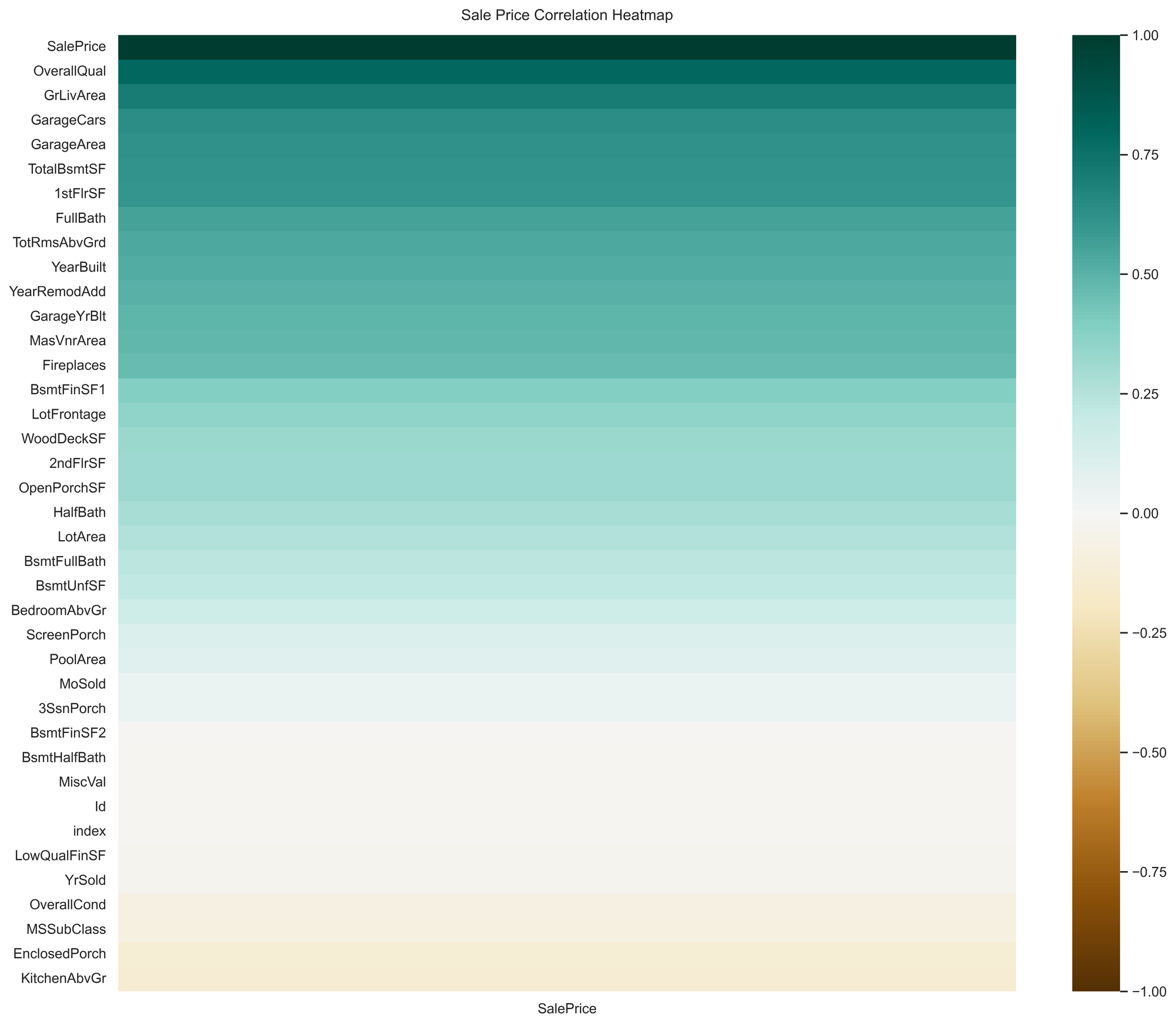
As side from SalePrice itself, this visual shows that the top 5 numerical features which correlates strongly with SalePrice are: OverallQual, GrLivArea, GarageCars, GarageArea, TotalBsmtSF. Now, we managed to narrow down the list of potential features from 79 to just 5 from just a single visual, hence very powerful.
As a working hypothesis, one could say that a larger living space means higher house prices. We can explore this relationship further by plotting a scatter graph between SalePrice and GrLivArea with the following code:
plt.scatter(train['GrLivArea'], train['SalePrice'], color = 'red')
plt.title('Sale Price vs GrLivArea - Training Set')
plt.xlabel('GrLivArea')
plt.ylabel('Sale Price')
plt.show()
The result is as shown below:
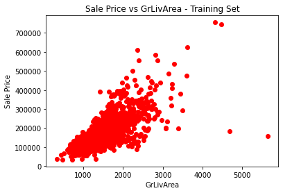
As shown in the figure above, aside from a few outliers, there is a linear relation between GrLivArea and the SalePrice. This supports our working hypothesis.
Now it's time for modelling. For simplicity, I will just use the 5 features we found so far to train a model.
features = ['OverallQual', 'GrLivArea',
            'GarageCars', 'GarageArea', 'TotalBsmtSF']

X_train = pd.DataFrame(train[features])
y_train = train.iloc[:, -1].values
X_test = pd.DataFrame(test[features])
Treat for missing values in the features by using the method of imputation by he median.
print(X_test.isnull().sum())
X_test['GarageCars'] = X_test['GarageCars'].replace(np.NaN, X_test['GarageCars'].median())
X_test['GarageArea'] = X_test['GarageArea'].replace(np.NaN, X_test['GarageArea'].median())
X_test['TotalBsmtSF'] = X_test['TotalBsmtSF'].replace(np.NaN, X_test['TotalBsmtSF'].median())
For my model, I used Random Forest Regressor.
# Training Random Forest Regression
from sklearn.ensemble import RandomForestRegressor
rfg = RandomForestRegressor()
rfg.fit(X_train, y_train)
After training the model, I applied it on the X_test to predict the values for SalePrice and submitted my results to Kaggle.
# Predicting test set results
y_pred = rfg.predict(X_test)
print(y_pred)
My score on Kaggle is shown below:

Now whilst the score isn't the best, there are a couple takeaways that could help improve the score:
- Remove outliers from the data as they influence the accuracy of the model.
- Use a different model like XGBoost.
- Explore and incorporate categorical variables into the model.
Summary
When trying to model on data with 70+ variables, it is crucial to conduct EDA in order to reduce the number of variables from the many to just a few. This helps with building an intuitive model that can be easily translated to business users.