How to create a Shape Map for Power BI

Are you bored of bar charts? Do you want to be more creative with geographic data? Are the standard point maps not useful? Look no further, as in this article I will walkthrough how to create shapemap visuals for Power BI. If you don't know what a shapemap is, it looks something like below.
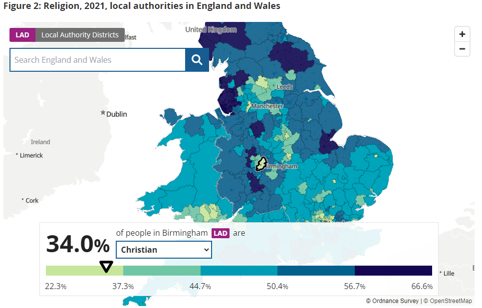
As illustarted above, shapemap visuals are very powerful in clearly telling a story about the distribution of a certain characteristic, in this case religious affliliation, of a population.
Together, we are going to replicate the above in Power BI but first let's take a quick look at the data we are going to use.
The data we will use is the 2021 religion census data taken from the Office of National Statistics (ONS). A simplified version for this walkthrough can be downloaded here. This is what it should look like:
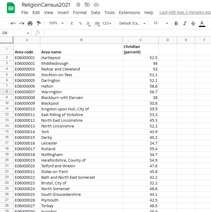
The Area code is just a unique alpha-numeric identifier for each area in the England and Wales. This is equivalent to Local Authority District Code. The column Christian (percent) is the percentage of the entire population of England and Wales that describe themselves as Christian.
Step 1
Firstly, open up Power BI Desktop and select the Shape map visual as shown below.
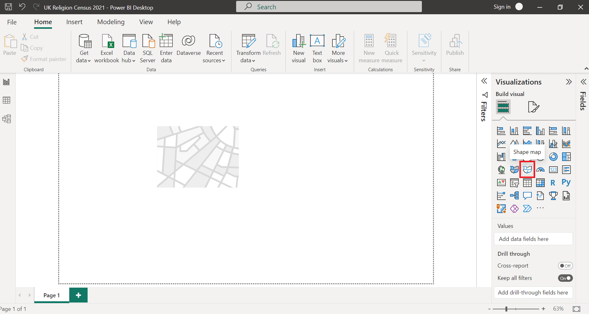
If this visual does not seem available, make sure you have enabled it by going into File > Settings > Options > Preview feature > Shape map visual as shown below.
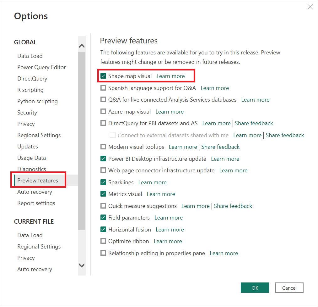
After you have done this, you will need to restart Power B Desktop for the Shape map visual to appear. Once that's done, move on to the next step.
Step 2
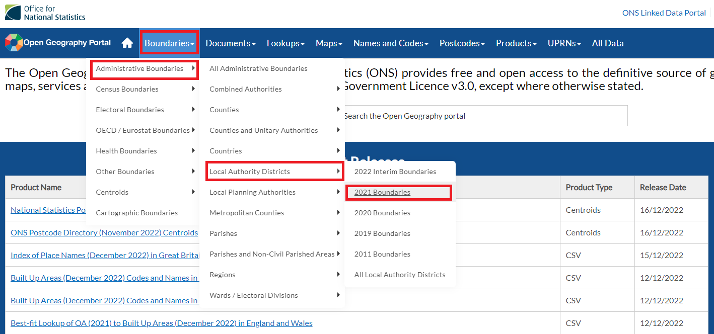
A Shape map visual requires a Shapefile which can be found by going to the Open Georgraphy Portal website, which hosts many different kinds of Shapefiles. As shown below, click through to Boundaries > Administrative Boundaries > Local Authority Districts > 2021 Boundaries.
This opens up a list of Shapefiles of the 2021 boundaries of the Local Authority Districts in UK. Each item on the list appears the same but they differ by the last 3 letters. Select the one with the last 3 letters as 'BUC', the letter 'U' stands for ultra-generalised, as this will be the smallest file size.
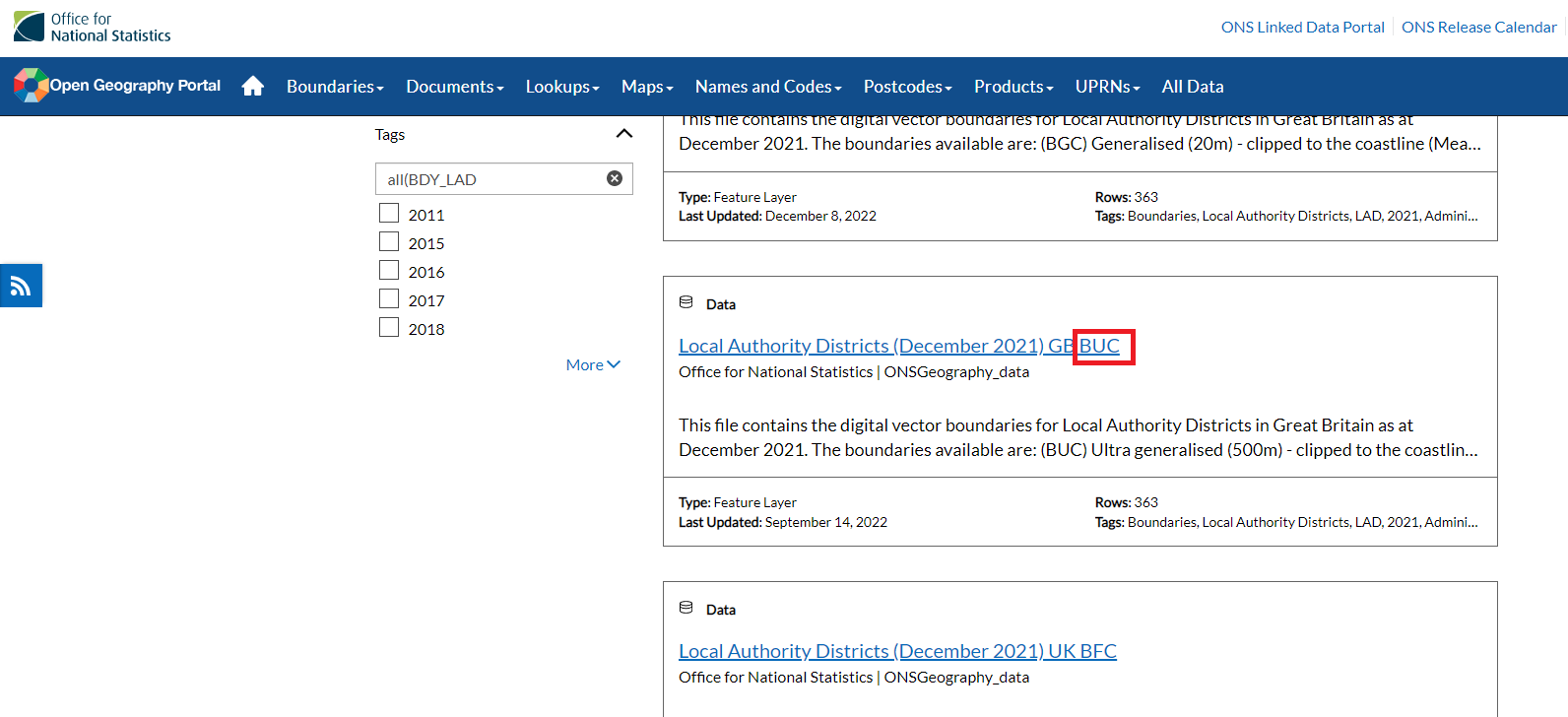
Then click on the item and download as a Shapefile.
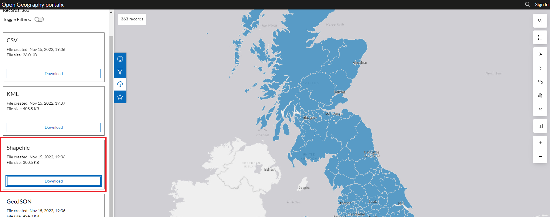
This will be downloaded as a zip file which can be extracted to a suitable folder of your choice.
Step 3
The Shapefile that you have just downloaded and saved in a folder will look something like this:

Despite the name, a Shapefile is actually a collection of different files. I will briefly explain the relevant ones below:
- .shp - this file contains the cartesian coordinates.
- .dbf - this file contains the attributes, e.g. Area code.
- .shx - this file links the coordinates with the attributes.
- .prj - this file contains the map projection, e.g. OSGB36 or WGS84.
Something important to state here is that for Shape map visuals to work in Power BI, it requires the Shapefile to be in TopoJSON format. As we will see, however, the Shapefile we just downloaded is in ESRI format which is unsuitable. Another thing to note is that Power BI also requires the projection to be WGS84. One way to change these is by using Map Shaper, a web based shape map software.
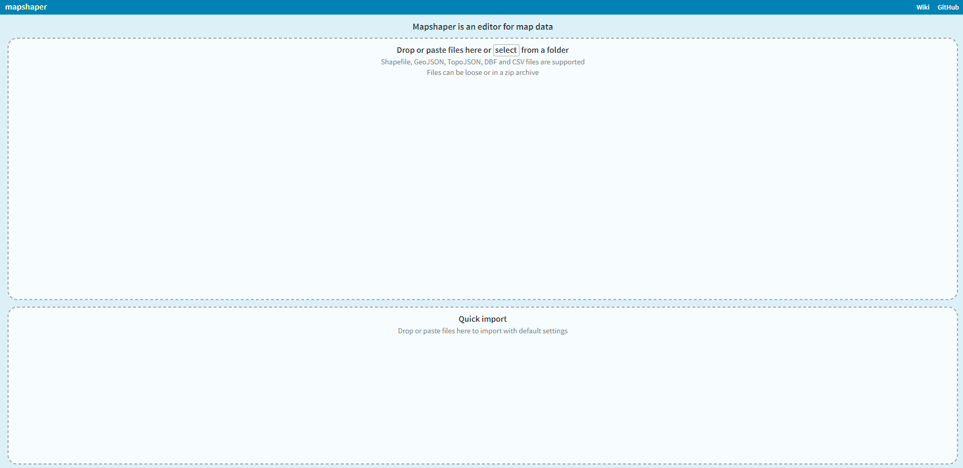
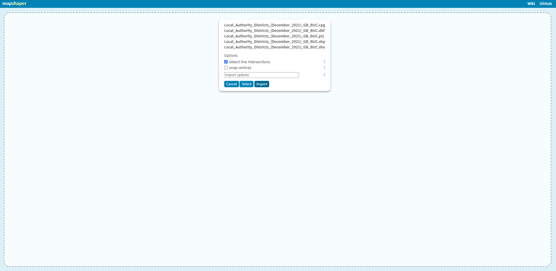
Import the folder which contains the Shapefile.
Now, you should have a Shape map that looks something like this.
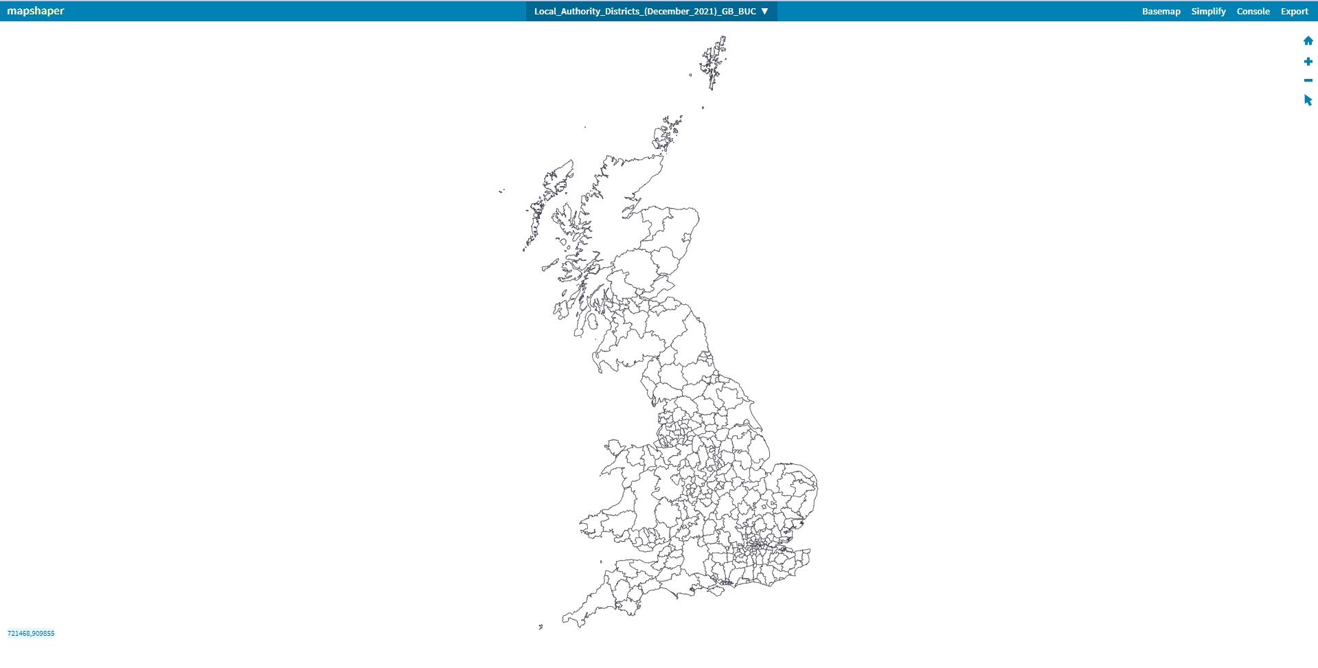
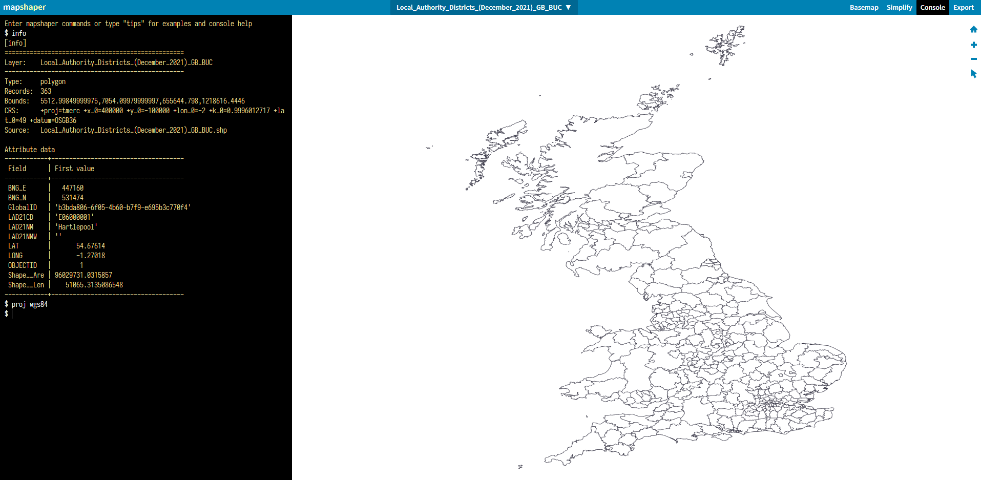
Click on Console and write the 'info' command to find out what projection the map is using as shown below.
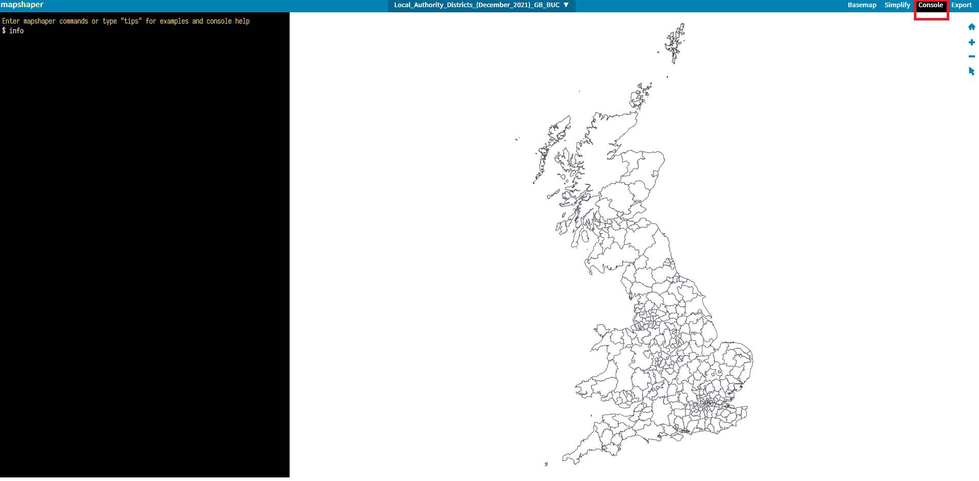
As you can see, the map is in a projection other than WGS84. Instead, it is using OSGB36.
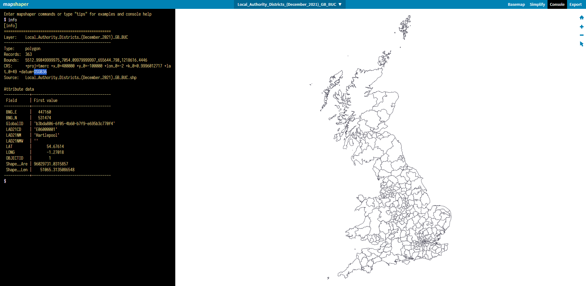
To change this, write the command proj wgs84. You can see how the map has now appeared flatter.
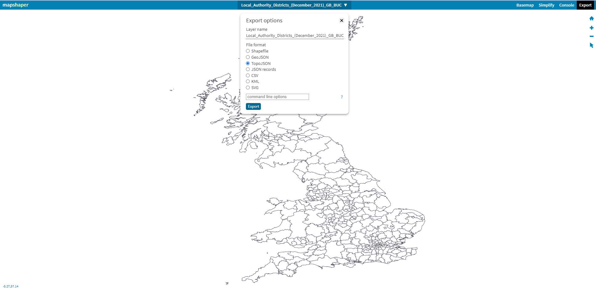
Export the Shapefile as a TopoJSON and save it in a relevant folder.
Step 4
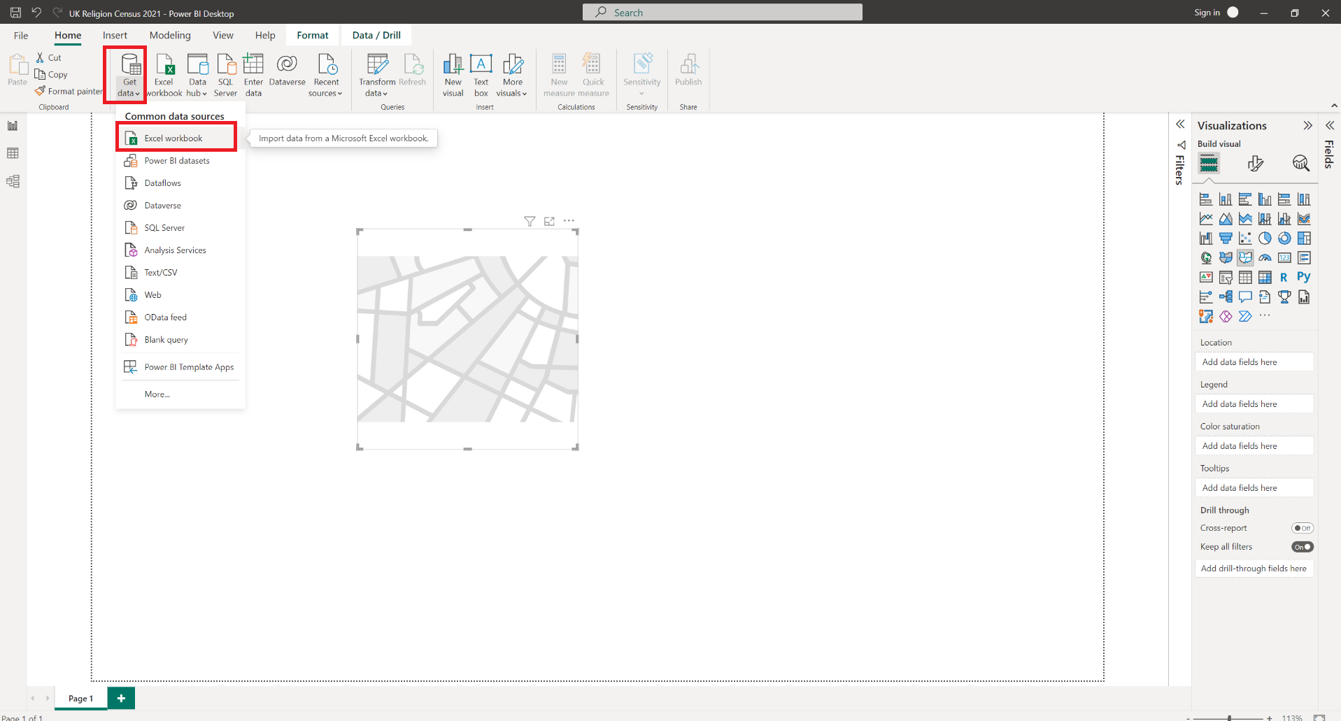
Go back to the Power BI file to import the data, which is an Excel workbook in this case, by clicking Get data as shown below.
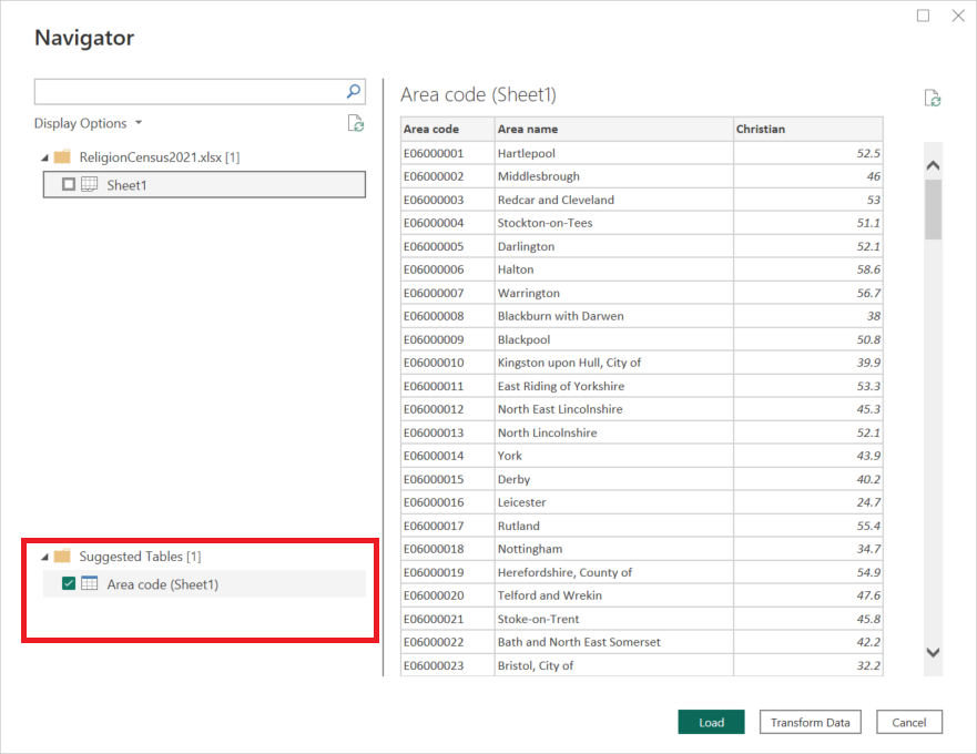
Then load the suggested table into Power BI.
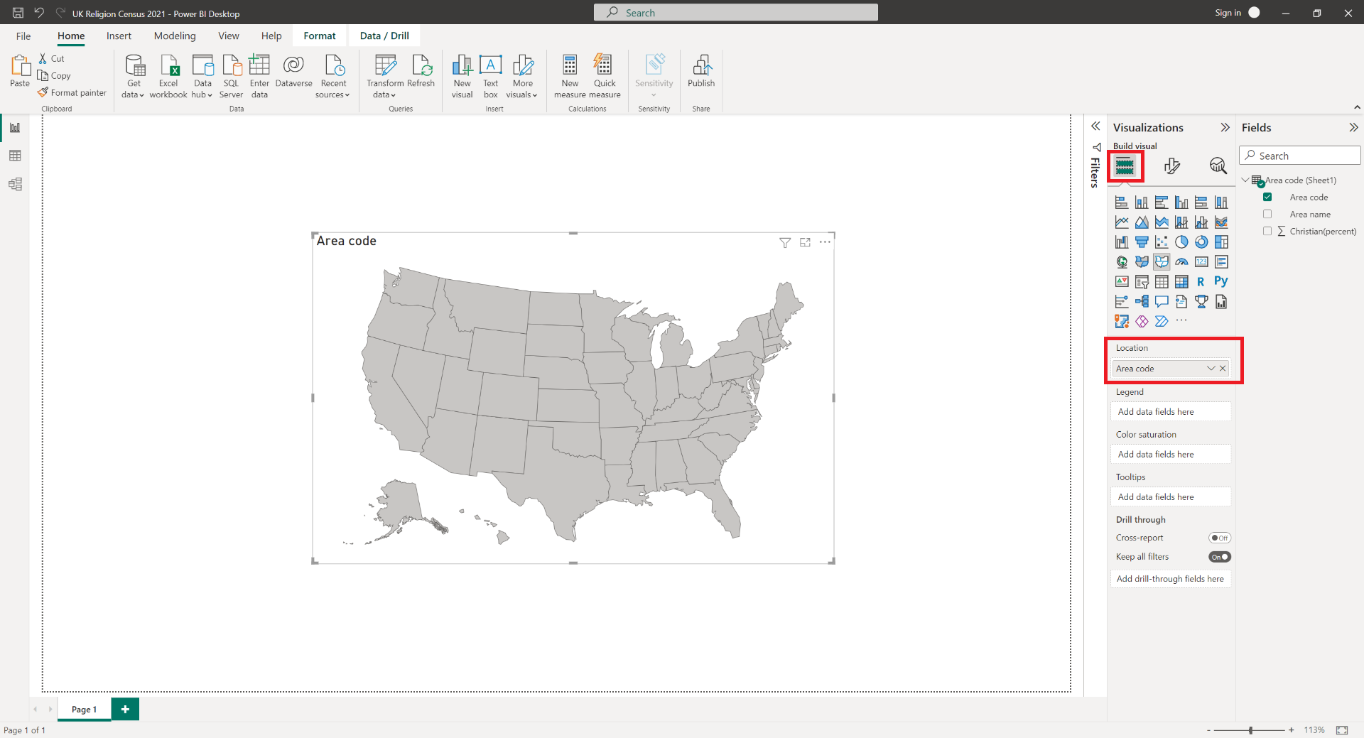
Drag and drop the column Area code into the Location field under Build Visual.
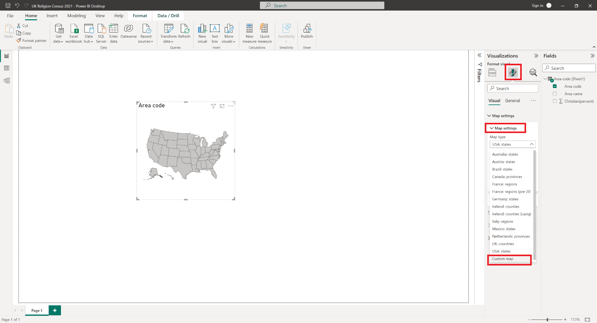
Import the newly formatted Shapefile by clicking through Format Visual > Map Settings > Map type > Custom map. Then select the relevant Shapefile.
Finally, drag and drop the column Christian(percent) into the Color saturation field under Build Visual.
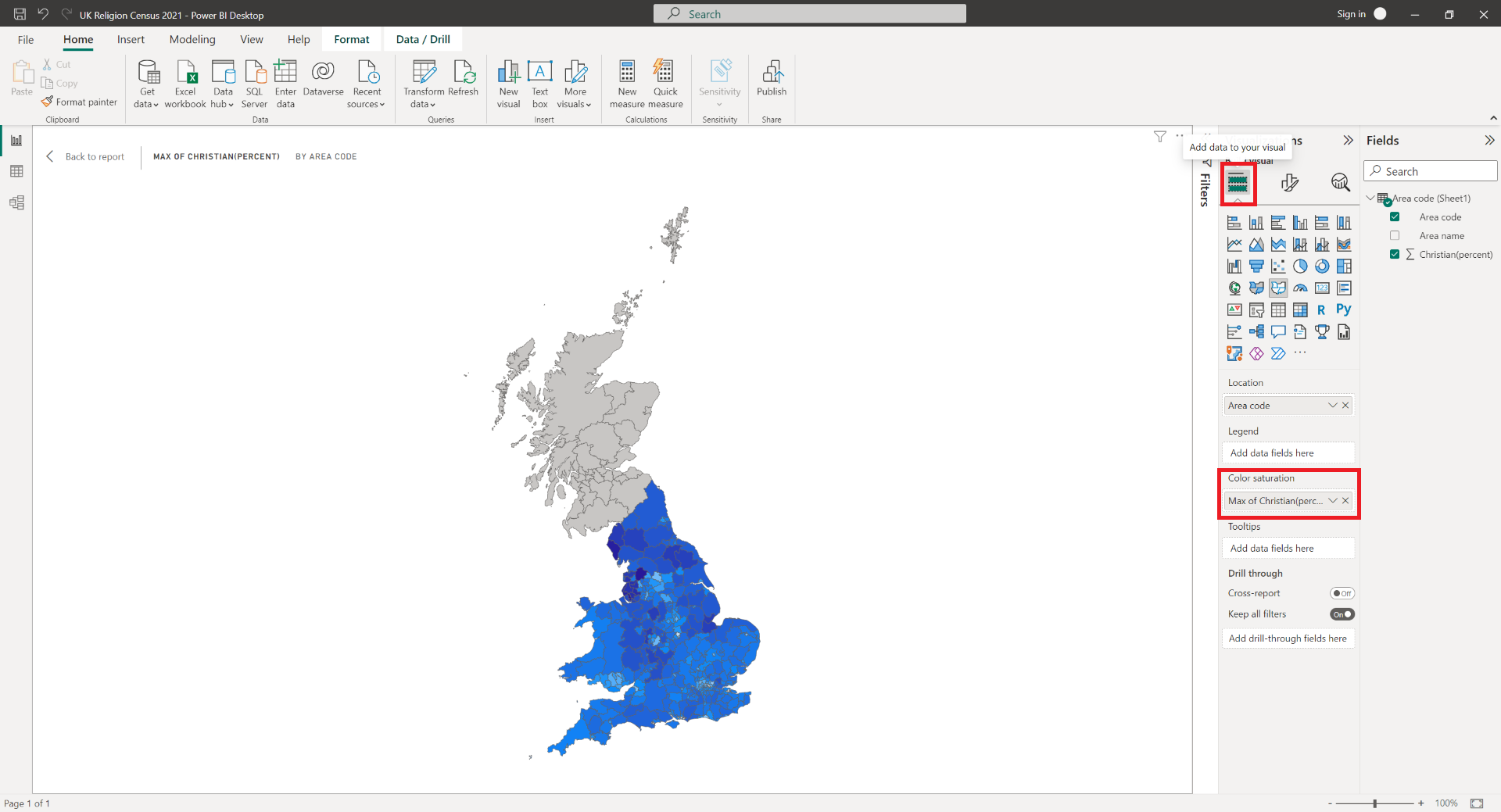
And there you have it! A Shape map which shows the percenatge of the population that describes themselves as Christian.
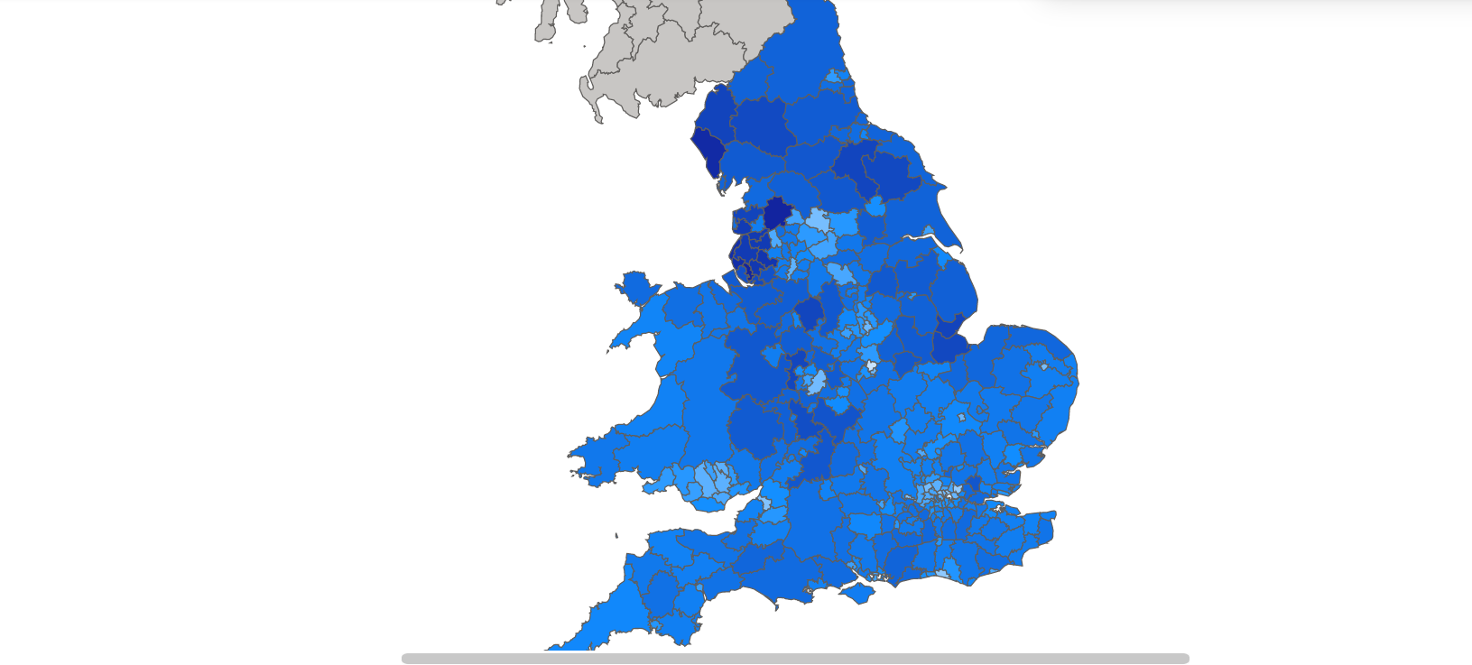
The darker the shade of blue in an area, the greater the percentage for that area. Quickly, we are able to see darker shades of blue around the North West of England, in contrast to South East for example, indictating a higher perecntage of the population whom describes themselves as Christian. Note that Scotland is grey because the census data is only for England and Wales.
If you made it this far, then thank you for reading and if you would like to stay up to date with more of these articles, then please subscribe below.

